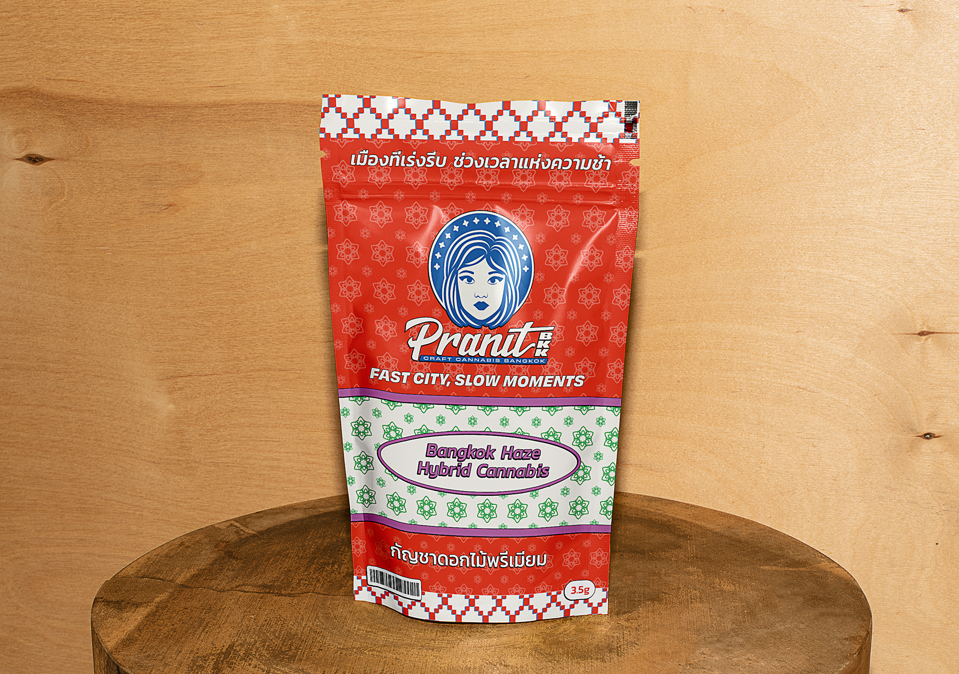
Jamie, one of the three partners at Pranit BKK, reached out to me to help create the visual identity for his new venture—a cannabis coffee shop based in Bangkok, Thailand.
What made this brand stand out was its hands-on approach: they grow their own plants and handle every part of the production themselves. It’s a small-scale, craft operation with a strong focus on quality and authenticity.
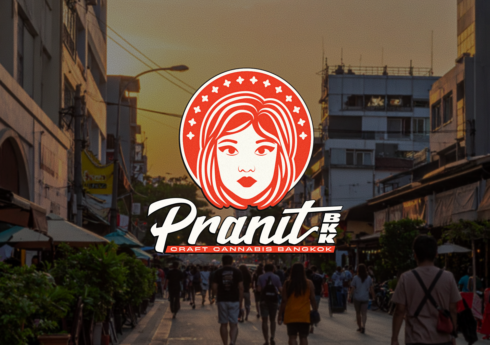
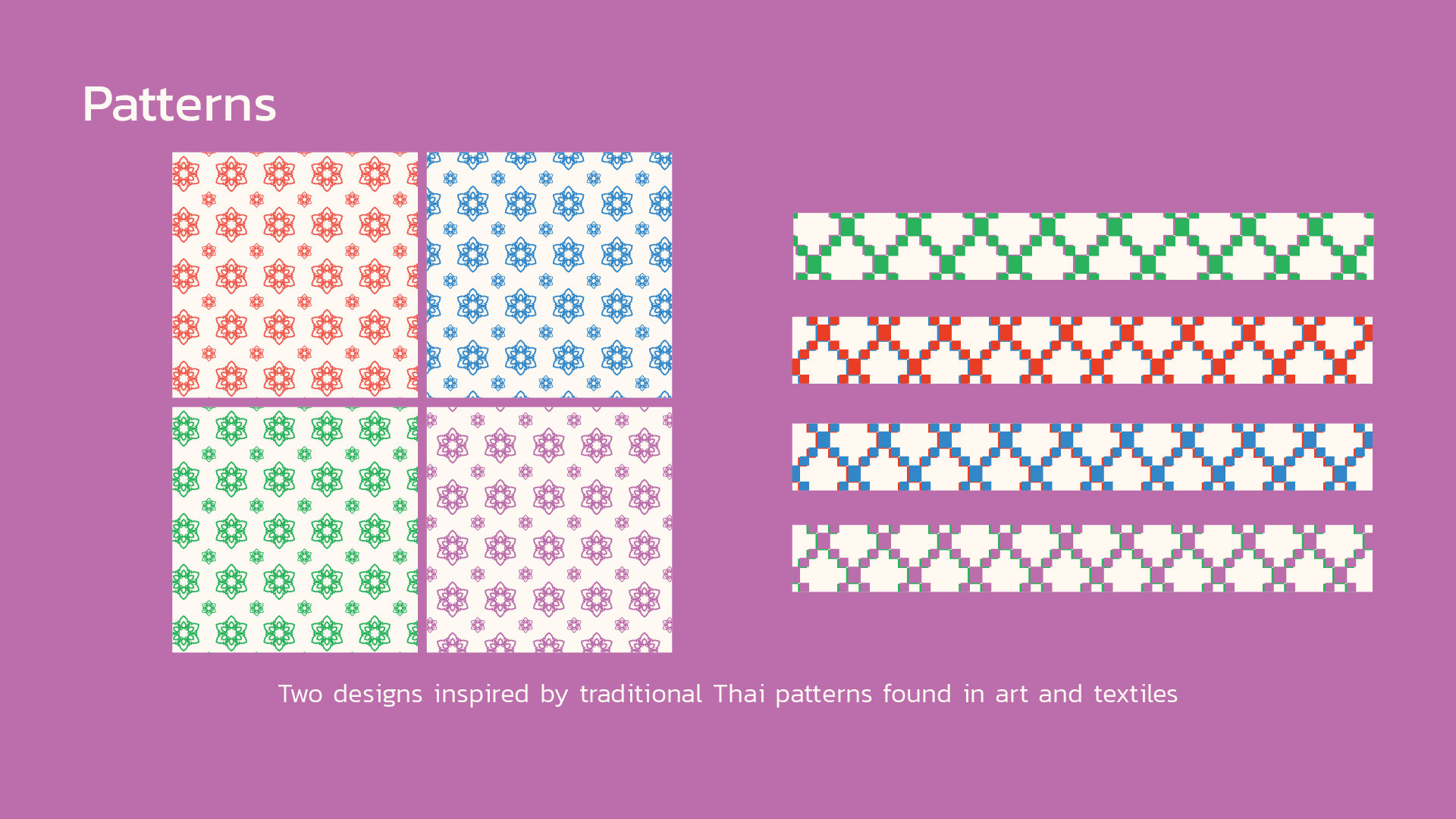
The biggest challenge was building the identity around the face of a Thai woman. This wasn’t just a stylistic choice, it was a tribute to one of the partners, a woman who’s deeply involved in the cultivation process. Alongside that, we aimed to bring in elements of Thai vernacular art and traditional patterns, while avoiding overused cannabis visuals like the typical weed leaf.

Designing a logo around a woman’s face brought its own challenges. It had to reflect the client’s vision without leaning into something too cartoonish or overly literal. Striking the right balance between personality and polish was key.
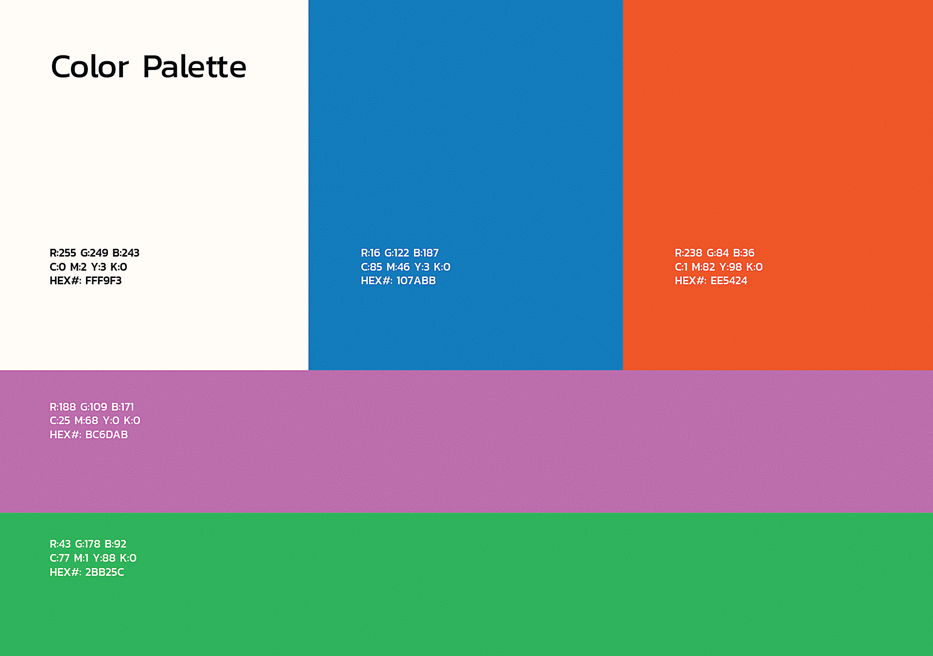
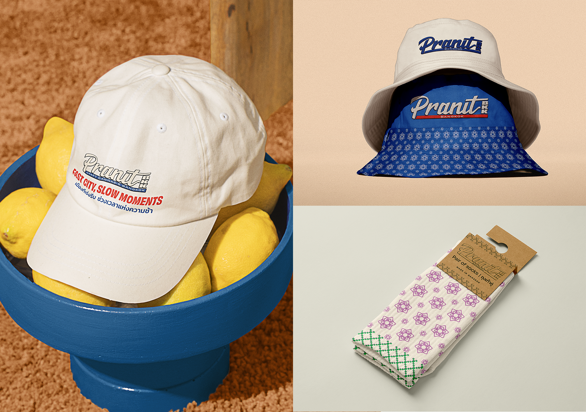
From the beginning, we knew we wanted a bold color palette and pattern work inspired by traditional Thai textiles. These elements helped build a strong, culturally rich foundation for the brand.
The final result is a colorful and playful visual identity that honors Thai tradition while standing out as a modern, handcrafted cannabis brand.


Thank You!


