Jamie, one of three partners at Pranit BKK, reached out to help create the visual identity for their new venture — a cannabis coffee shop located in Bangkok, Thailand.
What makes this brand special is its hands-on approach: they grow their own plants and handle every step of the production process. It's a small-scale, artisanal operation with a strong focus on quality and authenticity.

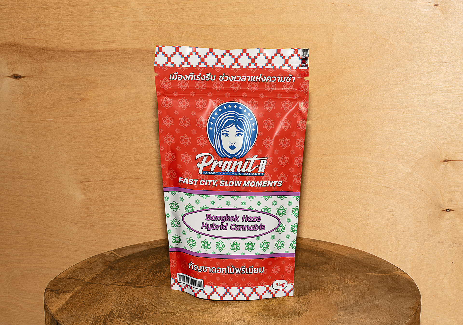
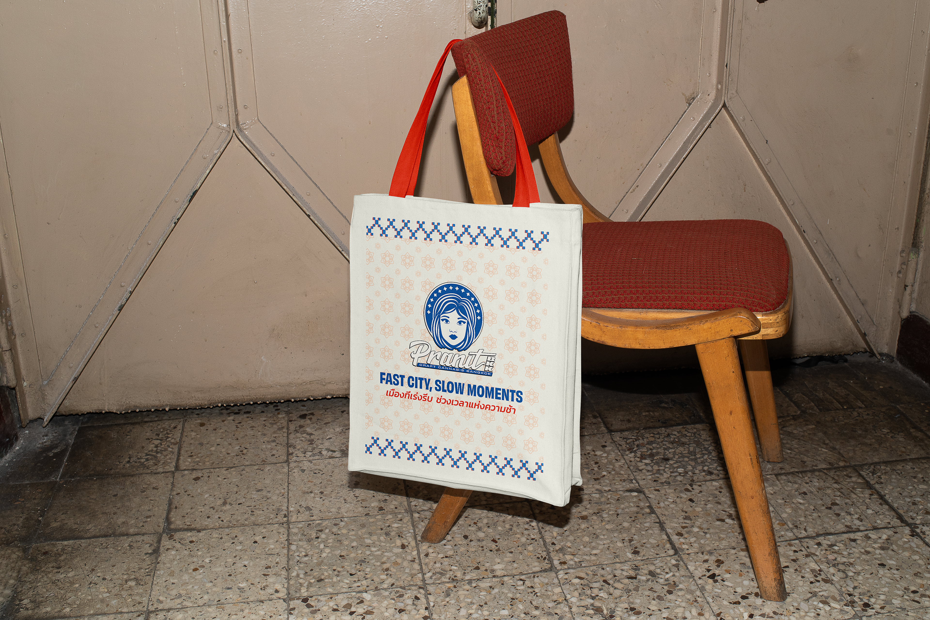
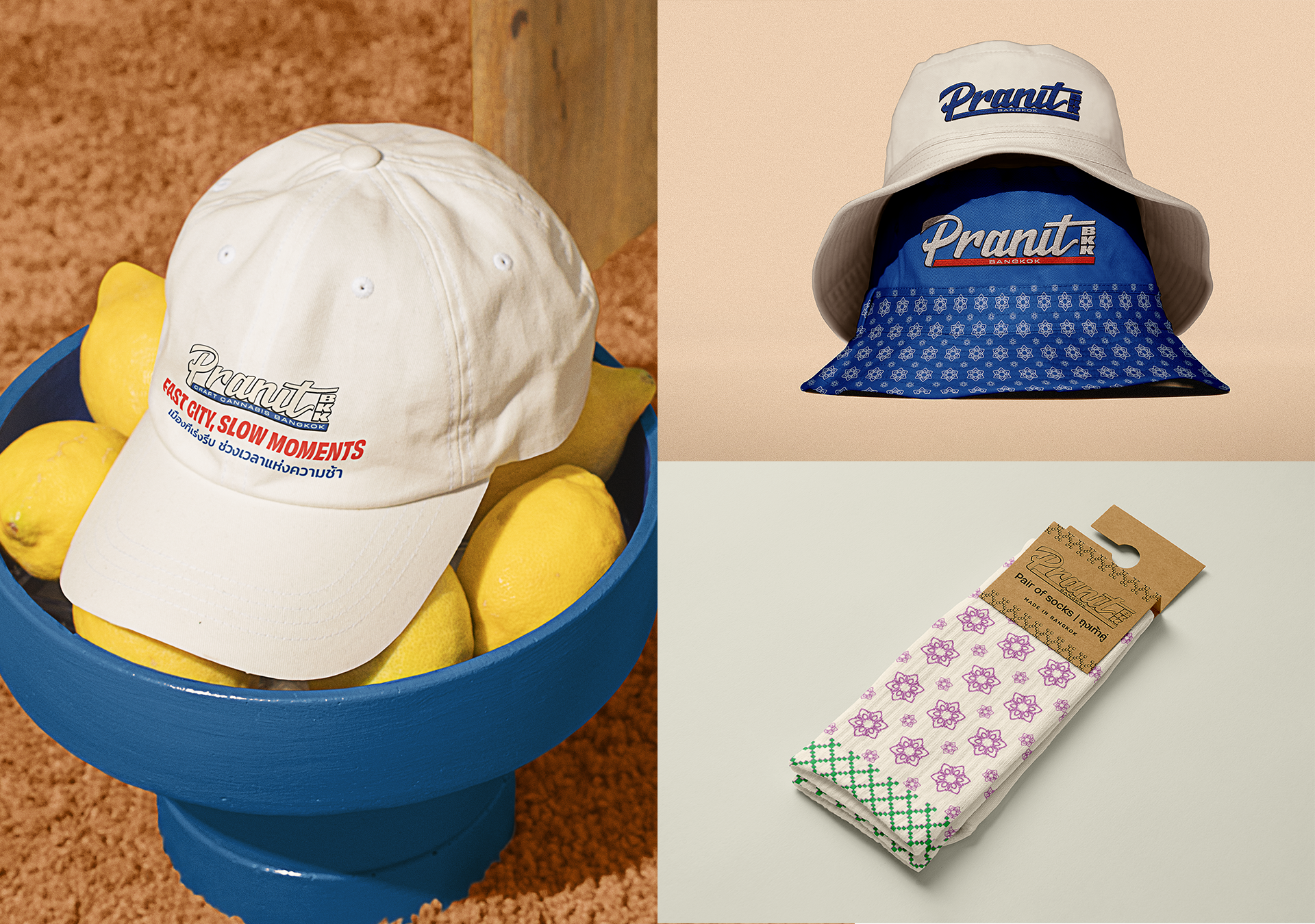
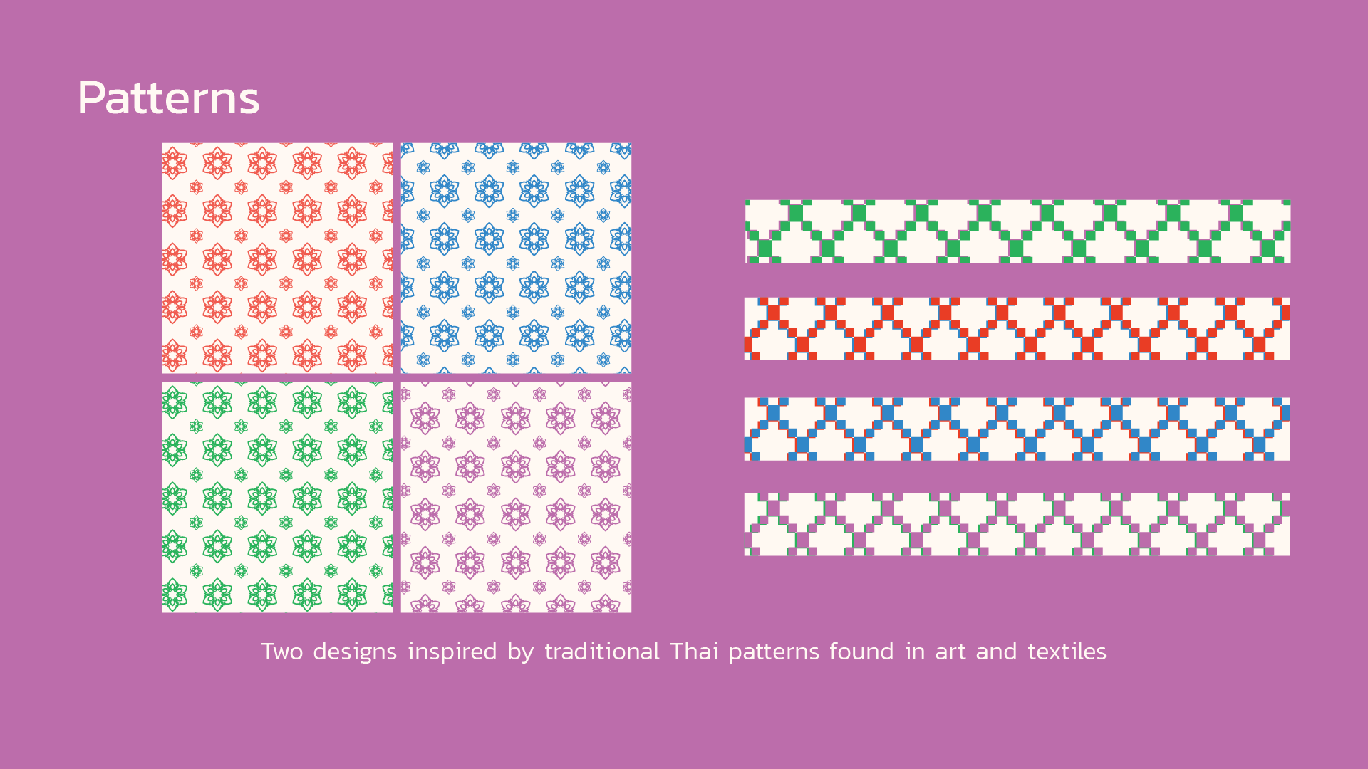
The biggest challenge was building the identity around the face of a Thai woman. This wasn't just a stylistic choice, but a tribute to one of the partners — a woman deeply involved in the cultivation process. We also sought to incorporate elements of Thai vernacular art and traditional patterns, while avoiding the visual clichés common in this market niche.
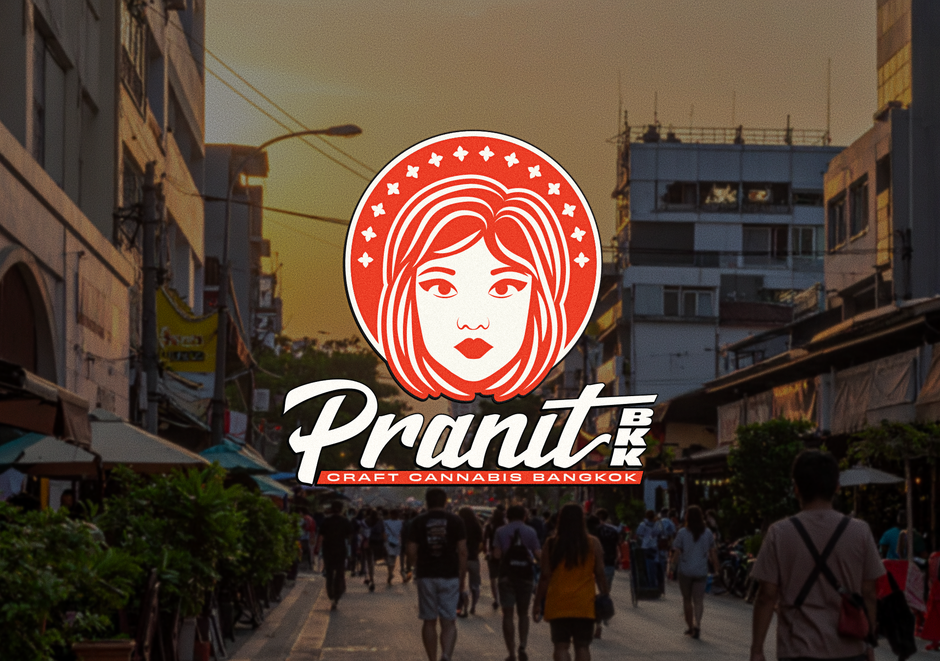
Creating a logo based on a woman's face brought its own set of challenges. It needed to reflect the client's vision without feeling too caricatured or overly literal. Finding the right balance between personality and sophistication was essential.
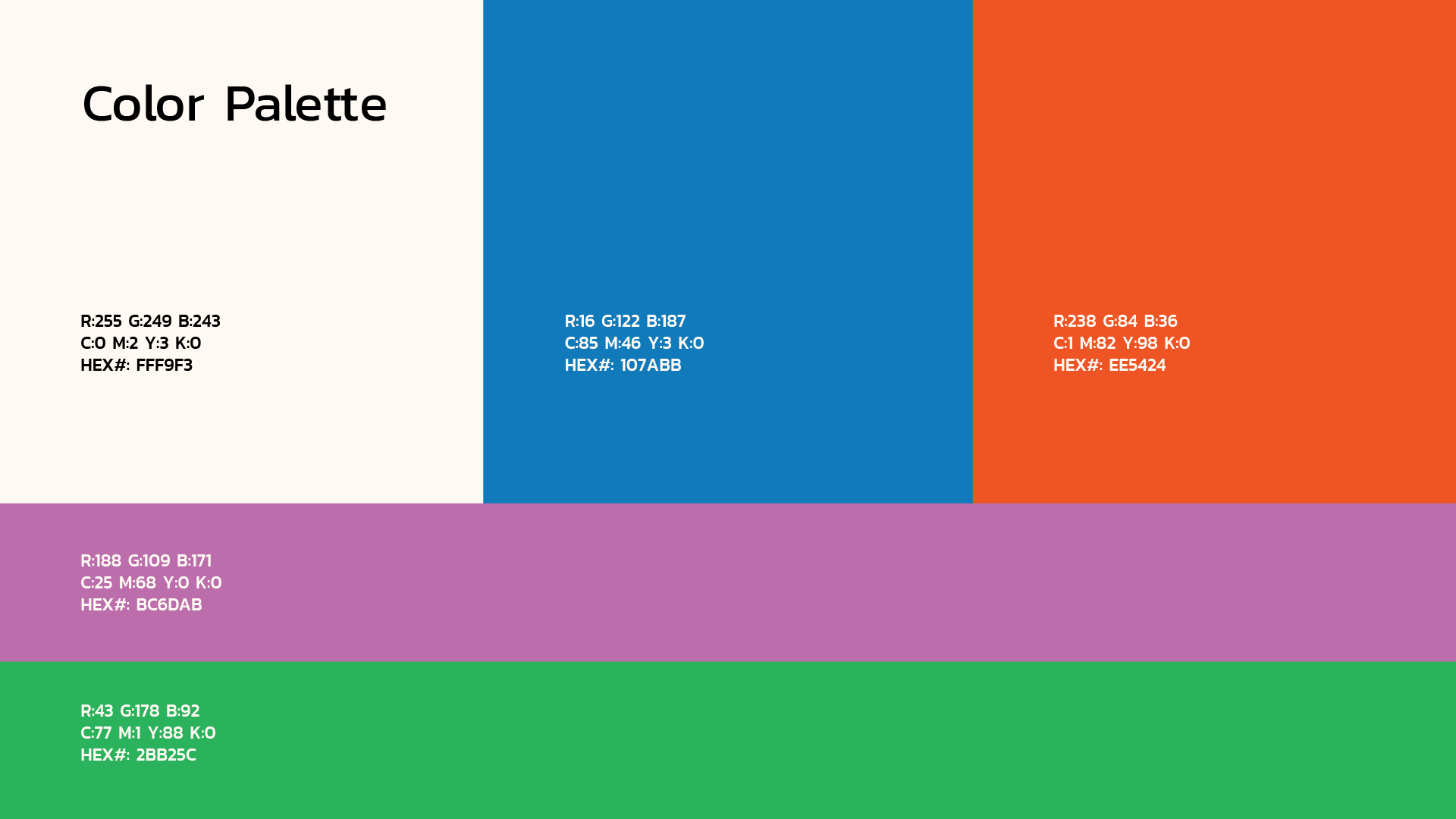
From the start, we knew we wanted a bold color palette and pattern work inspired by traditional Thai textiles. These elements helped build a strong, culturally rich foundation for the brand.
The result is a brand that feels rooted and intentional — one that honors its cultural context while standing out in a crowded market. Pranit BKK now carries a visual identity as layered and considered as the product itself.