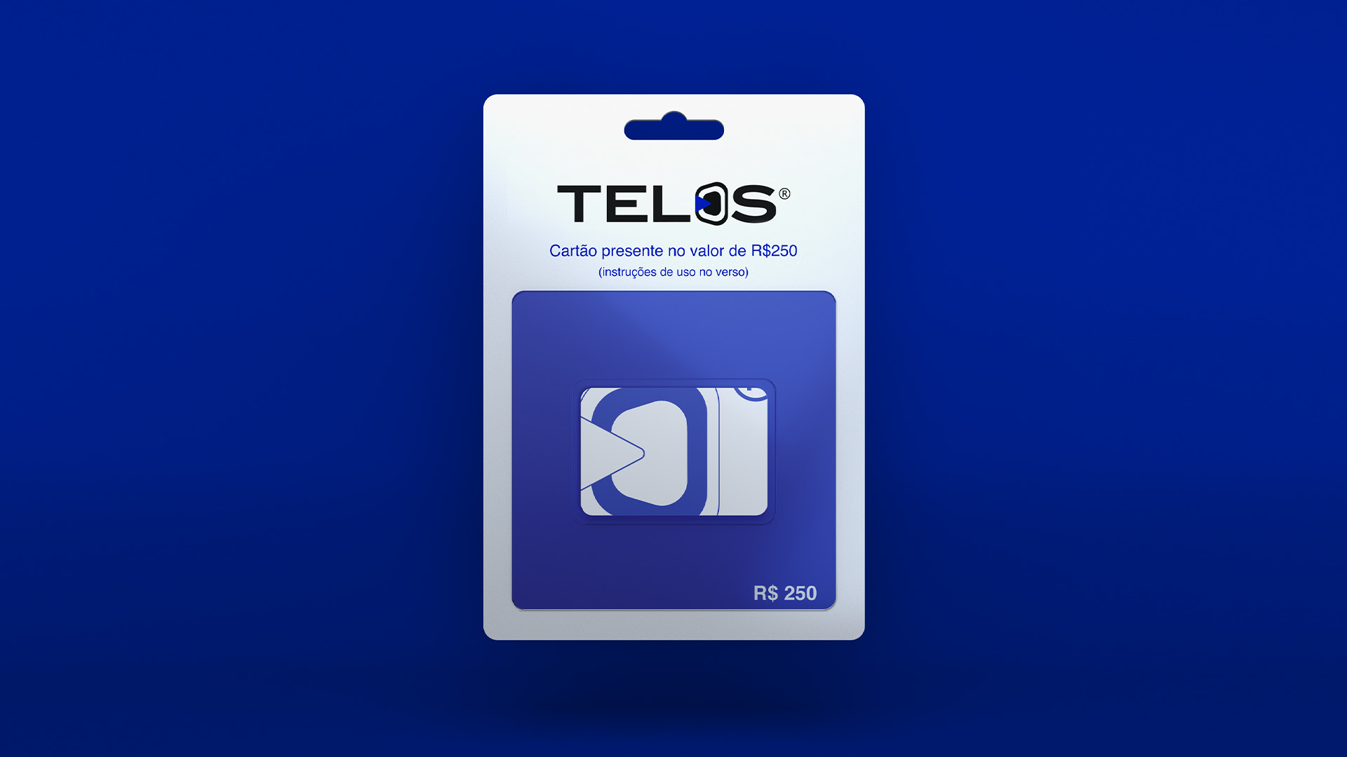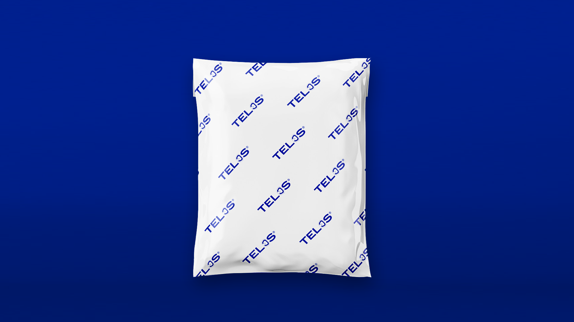
Telos was born from a simple idea: to create a basic t-shirt brand with quality and purpose. The name itself comes from Greek, meaning goal, endpoint — something with a clear direction. That was the foundation for the entire visual identity.

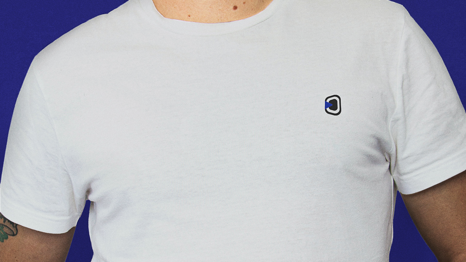
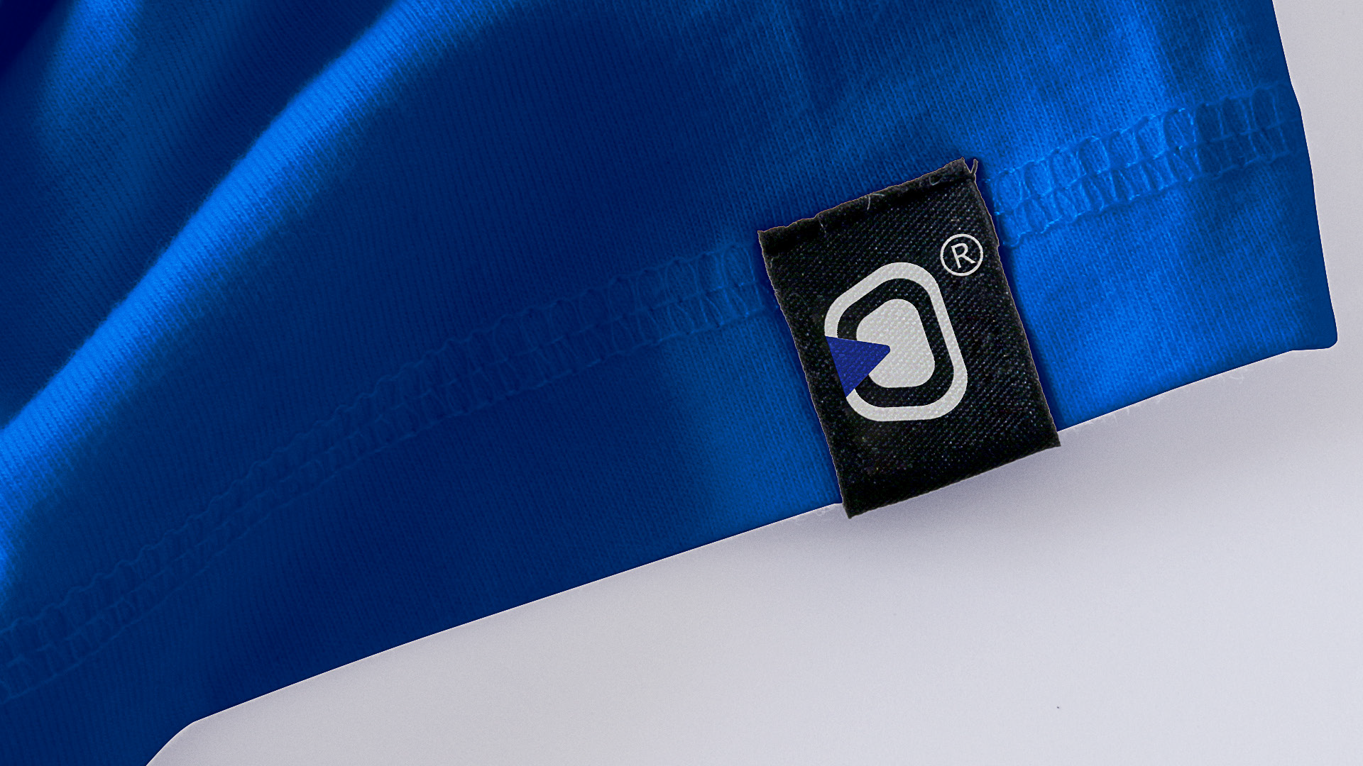
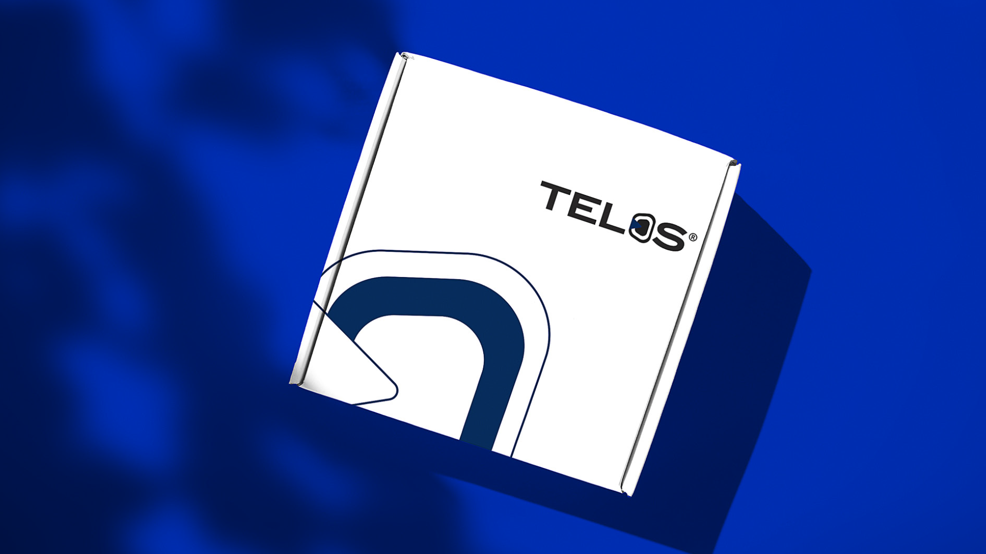
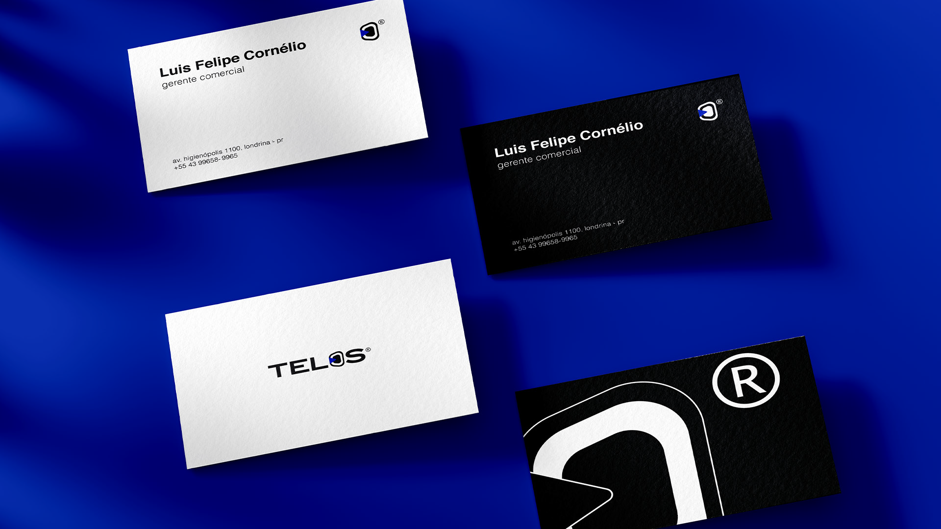
The symbol came from the image of a dart. The metaphor of precision and direction made perfect sense with the brand concept. Just as a dart finds its target, Telos pursues its place in a simple, essential way. The result was a minimalist arrow — direct and easy to recognize.
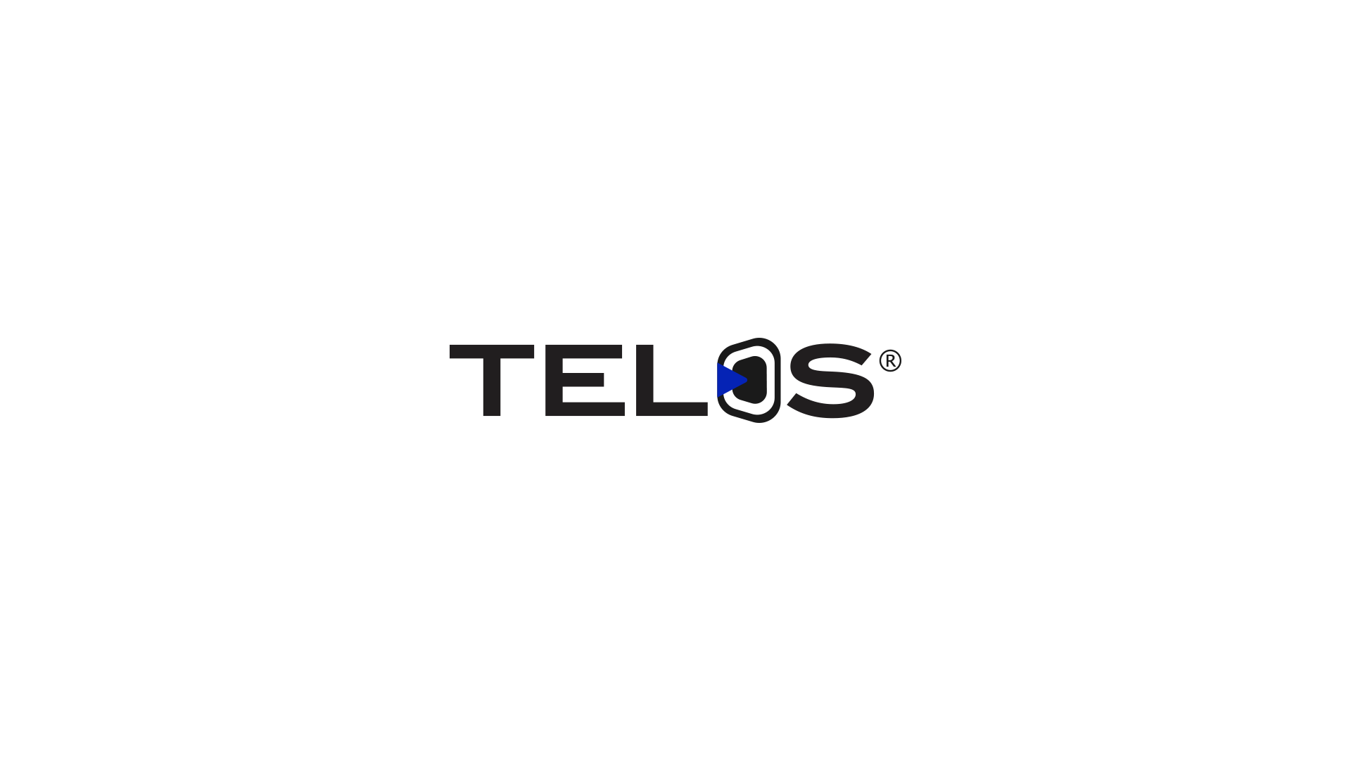
For the typography, I chose an expanded, bold typeface. The goal was to convey seriousness and solidity without losing a modern feel. The symbol and logotype together create a strong presence, but without excess.
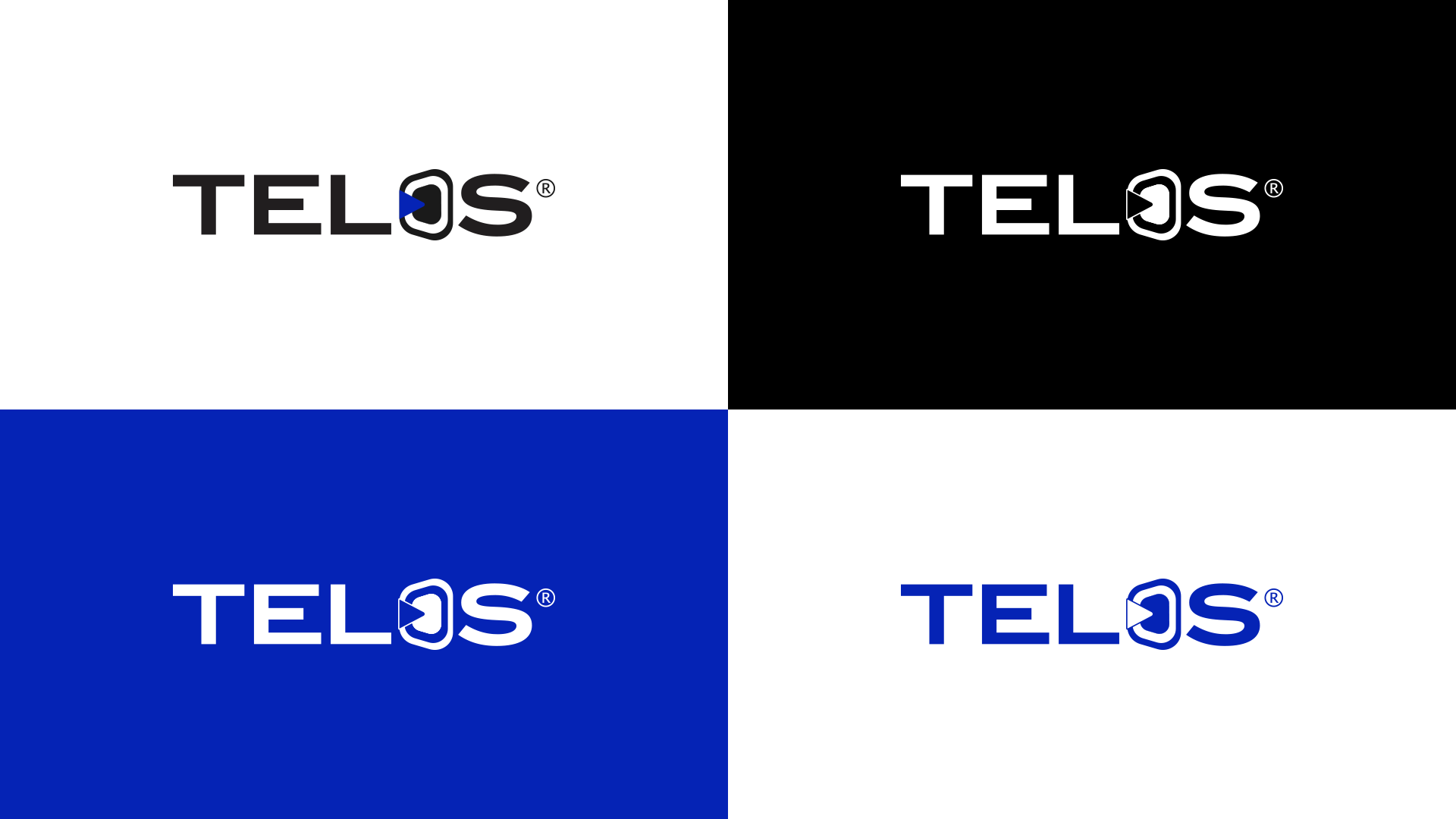
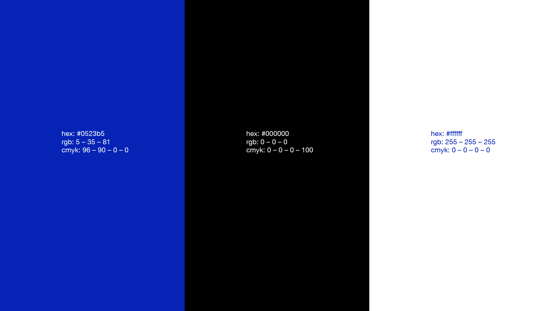
The colors reinforce this direction: blue as the primary, bringing confidence and stability, supported by black and white for balance and versatility. Helvetica as the secondary typeface — simple and functional, ensuring legibility across any application.
In the end, the identity says exactly what the name carries: Telos, the endpoint. A brand that knows where it's going — and looks the part.